Hey it's
UX/UI & Branding
that will make new employee onboarding a breeze.
Overview
To collaborate on a group project to bring the idea of First Day Kit to life.
Output
- Sales Pitch
- UX/UI design
- Branding Guidelines
Details
- 3 months
- Adobe Photoshop
- Adobe Illustrator
- Adobe InDesign
- Adobe XD
- Invision
Duration
Tools & Software
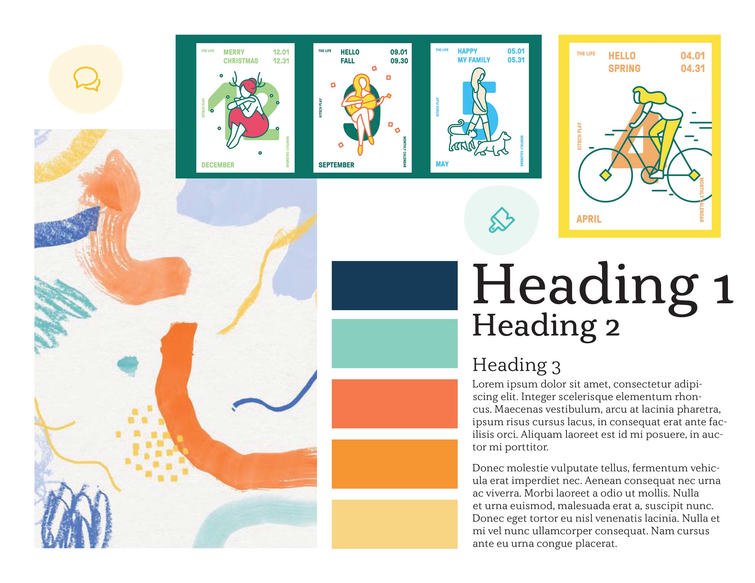
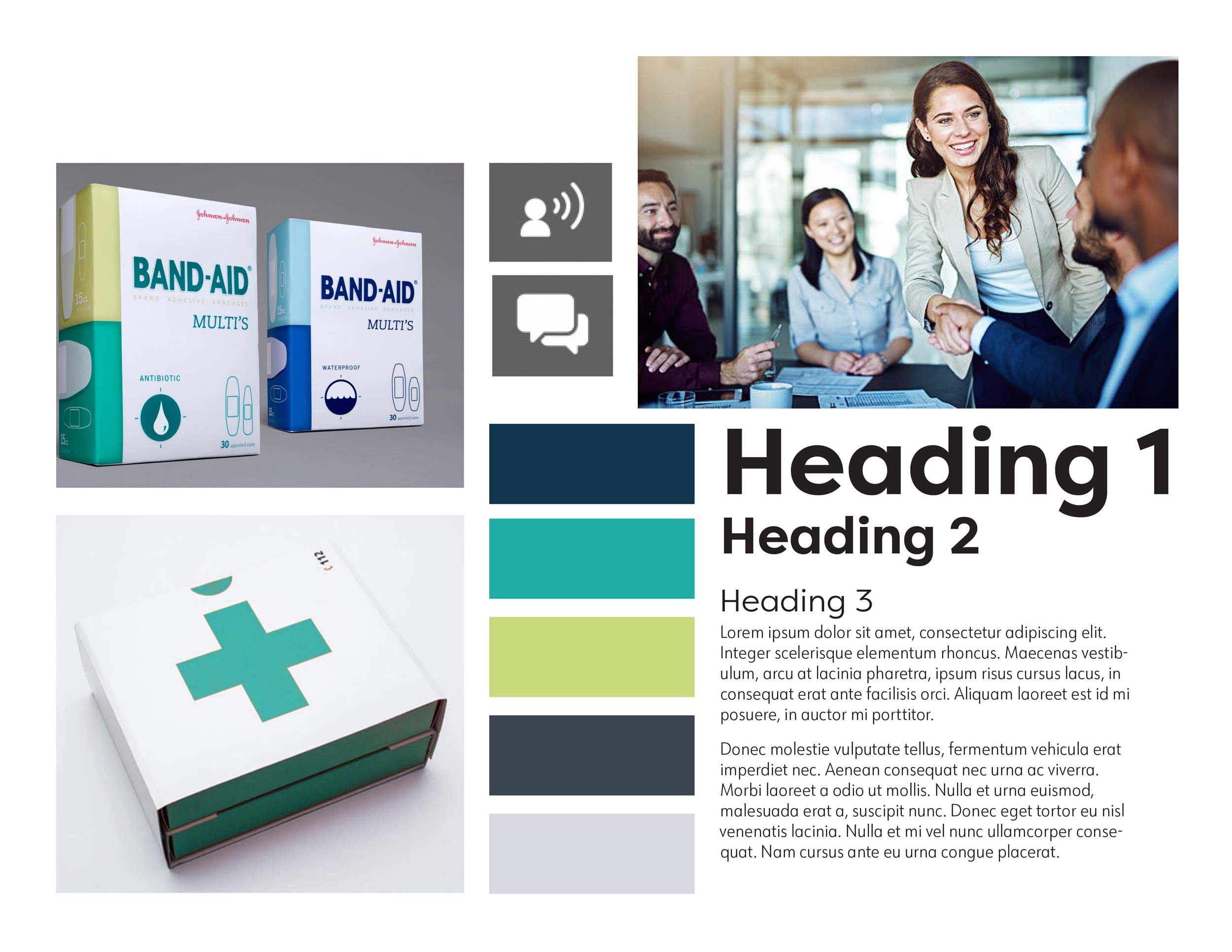
We had to come up with two concepts for our clients at Pinpoint HR for the First Day Kit. One was colourful and illustrative to bring fun to the office. The other we came up with was modern and simple to not confuse the employee in an already stressful situation.
Along with the two concepts, we had to present them with 6 logo ideas. They all liked and picked the colourful concept and the stylized F logo.
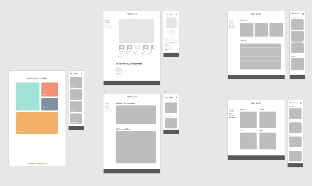
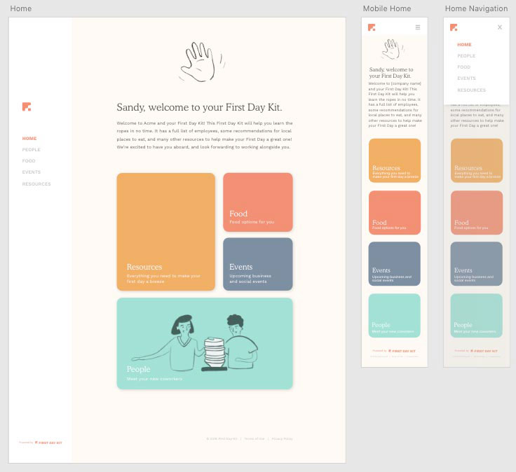
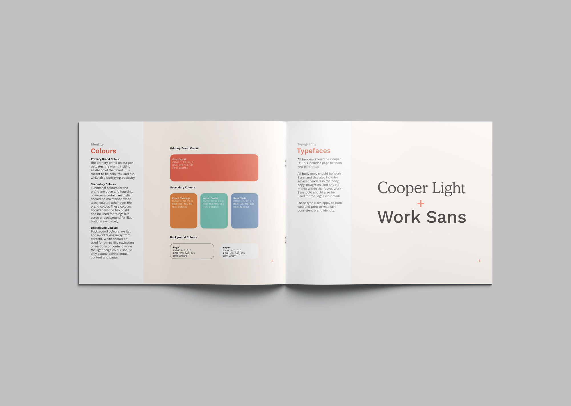
With the approval on the concept, we went into xd and started prototyping our wireframes. We wanted to play on the idea of the kit itself and have containers full of things the user will need on their first day. This also allowed us to decide on the colours for the brand so we could start on the illustrations.

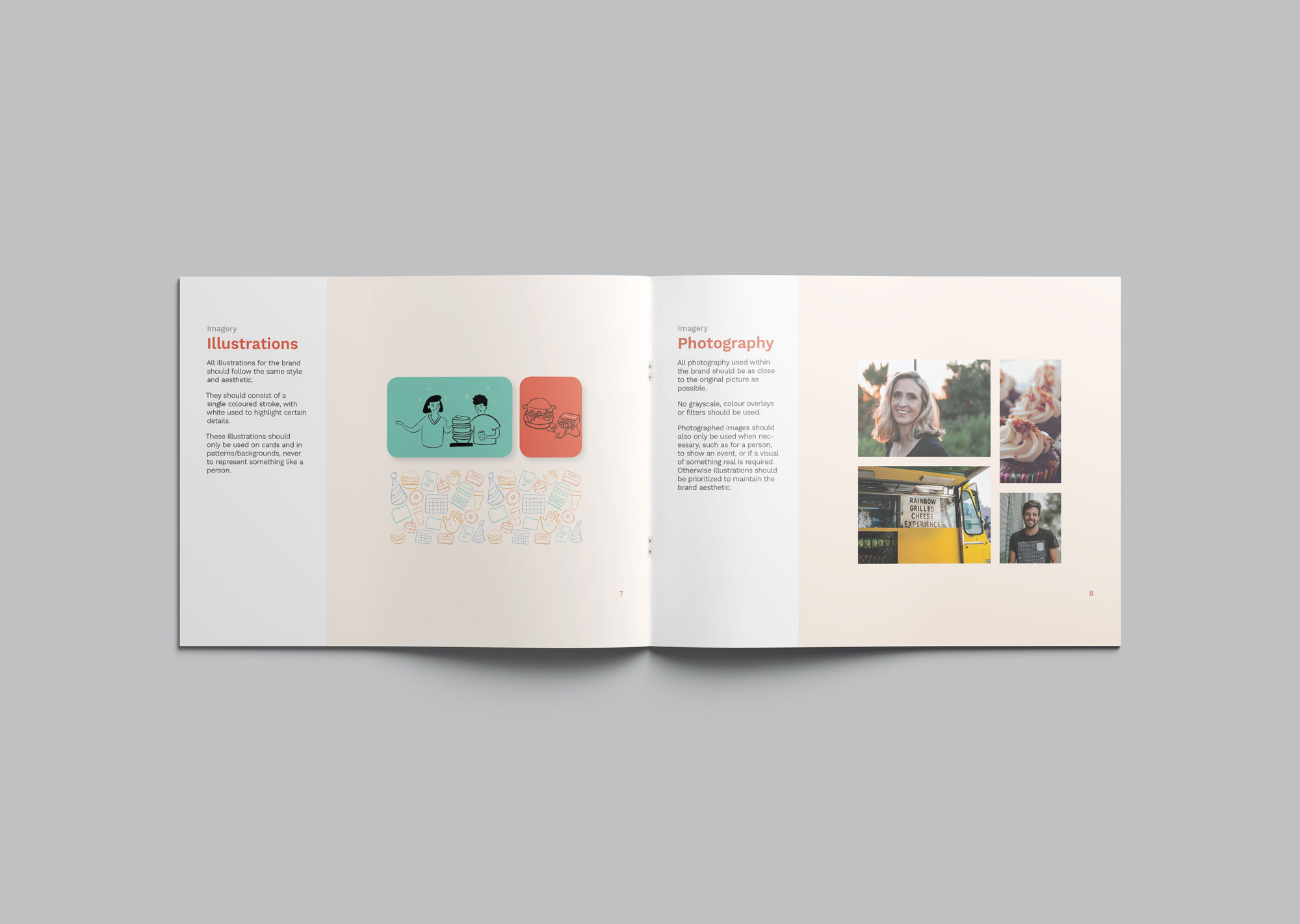
Once we picked colours, we went on to create the illustrations which I created for the app, which most of them were chosen to use in the app. It was fun yet challenging to try a different style of illustration, and I feel like it broadened my illustration skills.
This is a first iteration of our prototype. Where we established our typeface and a feel for the layout.
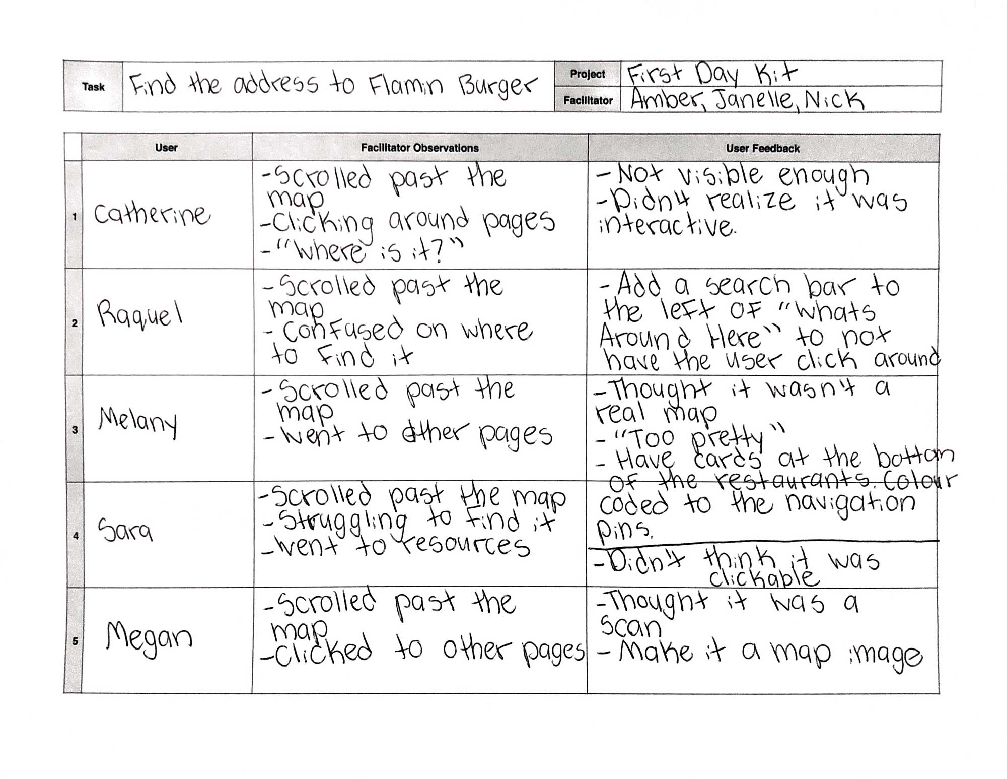
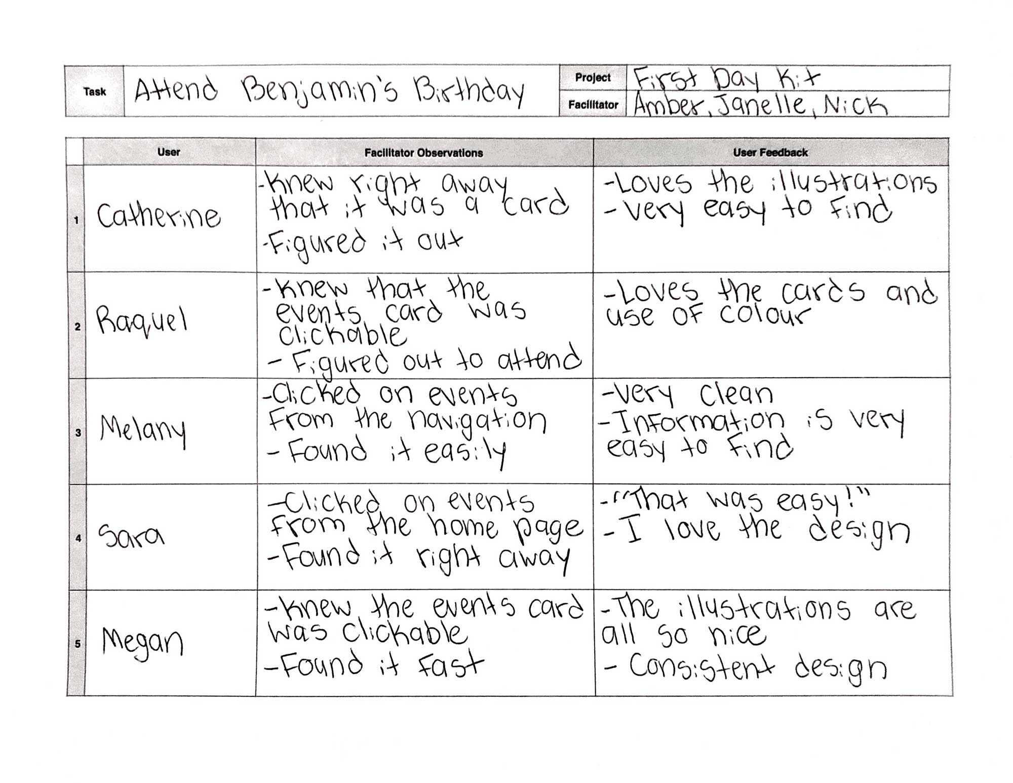
With the second iteration of our prototype we took it outside in the real world and got it tested by users where we found some issues that needed fixing for our next iteration.
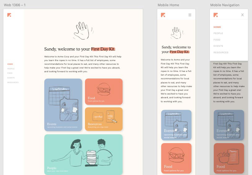
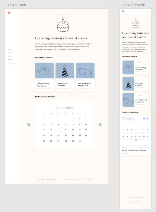
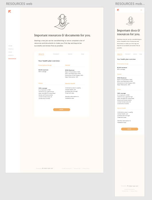
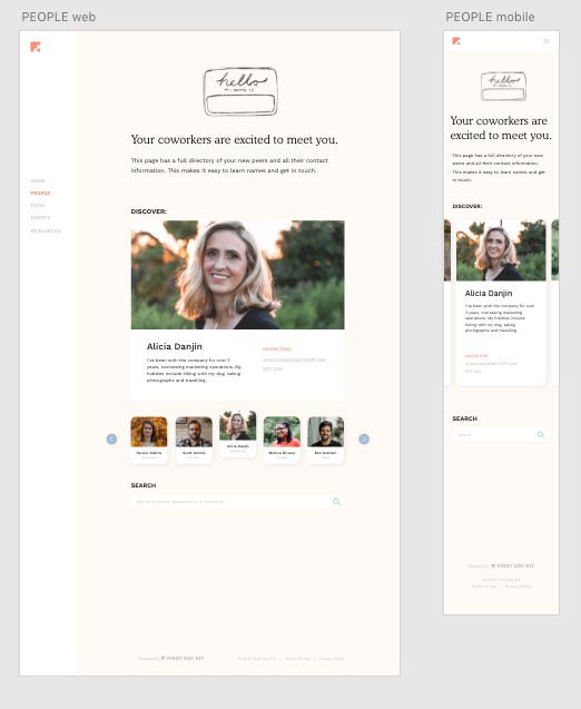
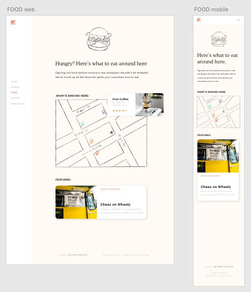
This is our final prototype of the First Day Kit. A clean and fun design to lessen the stress of an employee on their first day of work.
The Accomplished Objectives
Overall Brand Principles
It must be fun
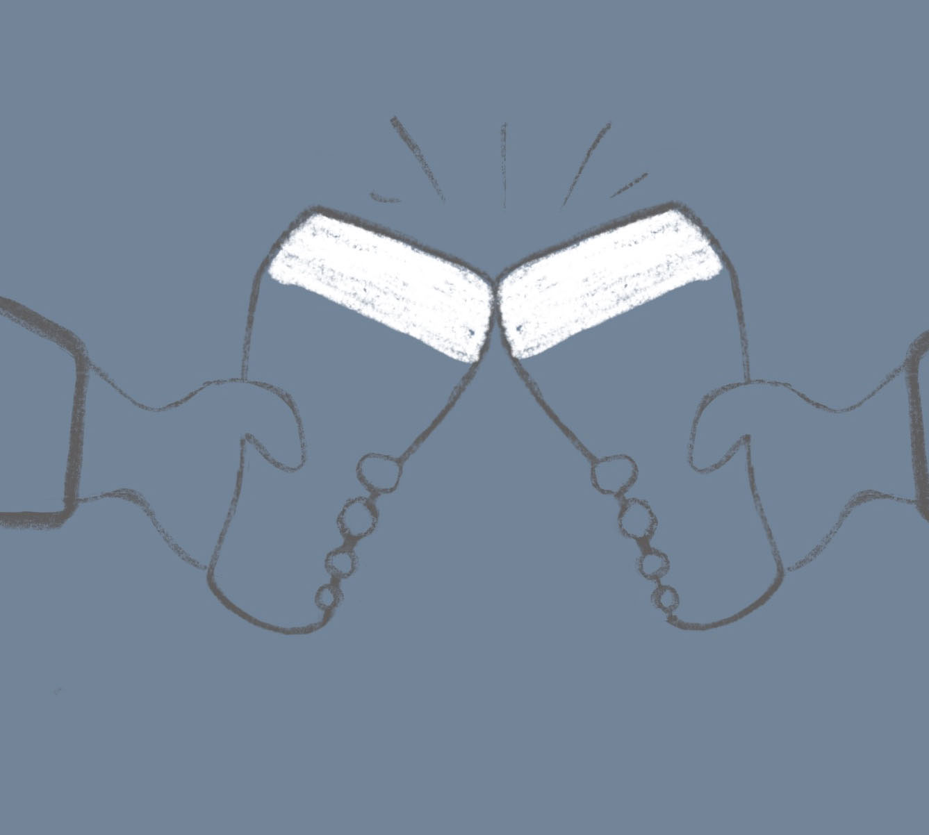
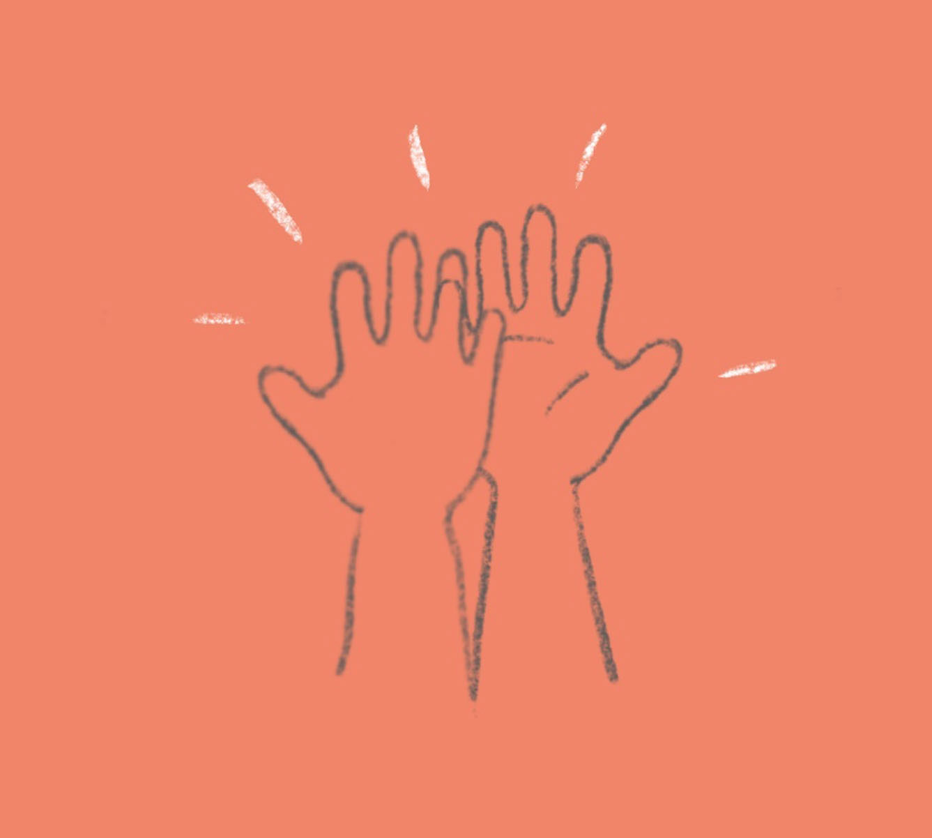
This brand should be immersive and an enjoyable user experience. Fun icons, illustrations and colours to intrigue users and keep them interested.
It has to be functional
Make sure usability is always maintained. The last thing an employee wants to do is fiddle around the portal.
It has to be essential
All the content and information should be valuable to the user. Fluff should and always be minimized.
Logo
The logo is a stylized F, but in the negative space, it completes a first aid like symbol. This is to represent that the portal is there to help new employees survive their first day of work.
Bringing Fun To The Office
The overall design is meant to bring fun to the workplace to ease the stress of new employees. With colours taken from things around the office and illustrations meant to look like doodles. These elements are intended to tone the seriousness down and to remind people to have fun on their first day.
